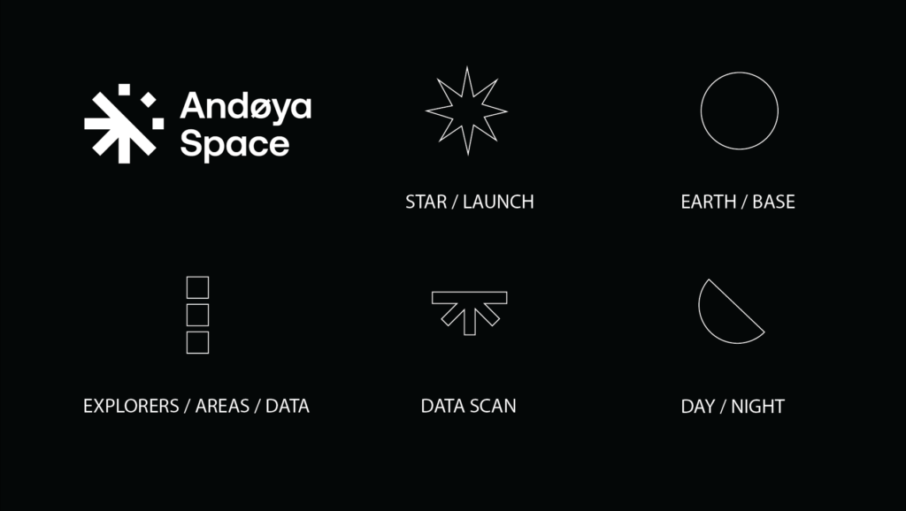
Our new logo is a stamp of quality, unity and a leading star in the space industry. But it is also so much more. Take a look behind the scenes to explore the story behind our brand new logo.

What do you see when you look at our new logo?
At Andøya Space, we have six decades of experience in the sounding rocket business. Over the years we have taken on yet new ventures: Testing, drones, education and satellites.
To clarify who we are and what we do, we are currently in the process of streamlining our entire organization under the brand Andøya Space. As a part of this we have developed a new visual identity for the company, highlighting our common identity of collaboration, quality and innovation.
Together, we enable scientists, students and engineers to achieve mission success and move our world forward.
A sign of collaboration
According to the team behind the logo, the symbol encompasses several subjects:
– The logo symbol is a quality stamp and a guiding star, as Andøya Space is a leading aerospace company, explains Roar Sager, creative leader and designer at Bold Scandinavia. – But what really distinguish Andøya Space from its competitors is the collaboration. Here, customers and employees lift each other to reach the stars.
The circular shape of the logo symbol can be viewed as a circle of collaboration, but the design is also inspired by space, natural forces and our key fields of operation.

Innovation and exploration
At Andøya, we look up and beyond. The duality of the logo signifies both day & night as well as earth & space. It could be a star or our earth all together, but more importantly the symbol can be seen as our horizon with stars, satellites and rockets flying above it. Or maybe it is northern lights up there?
Humans have always been captivated by the beautiful aurora seen in the two polar regions of Earth. Since our first sounding rocket launch in 1962, we have enabled scientists to study the northern lights from within. Due to our long and proud history involved with this research, it was natural to pick the green color of the aurora borealis as a leading color in our new profile.
New technologies
Our new logo highlights both the research and development of technology that finds place at Andøya.
We provide the means to fly, launch, test, research, educate and inspire. Whereas the three independent dots may symbolize our rockets, drones or satellites flying above the earth, the lower part of the logo symbol represents both lift off, a data scan and collection of data.
To some, it may also represent our different fields of operation – testing, space and education – as well as the roads leading you there.
Our new logo is a stamp of quality. It is a leading star and a symbol of collaboration and reaching for the stars with uncompromising quality and safety. These are values that lay at the core of Andøya Space.

